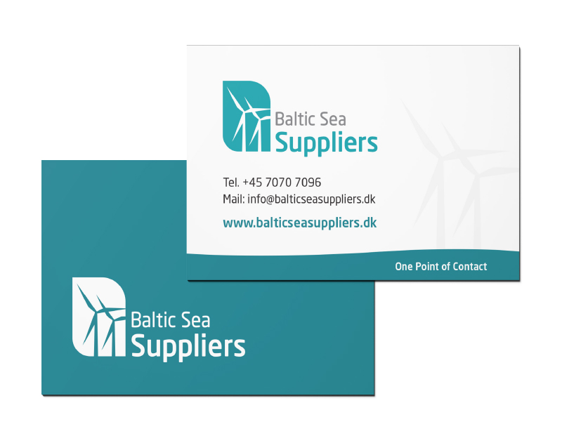
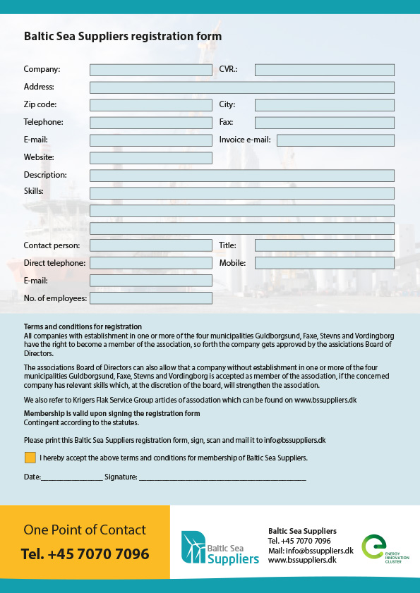
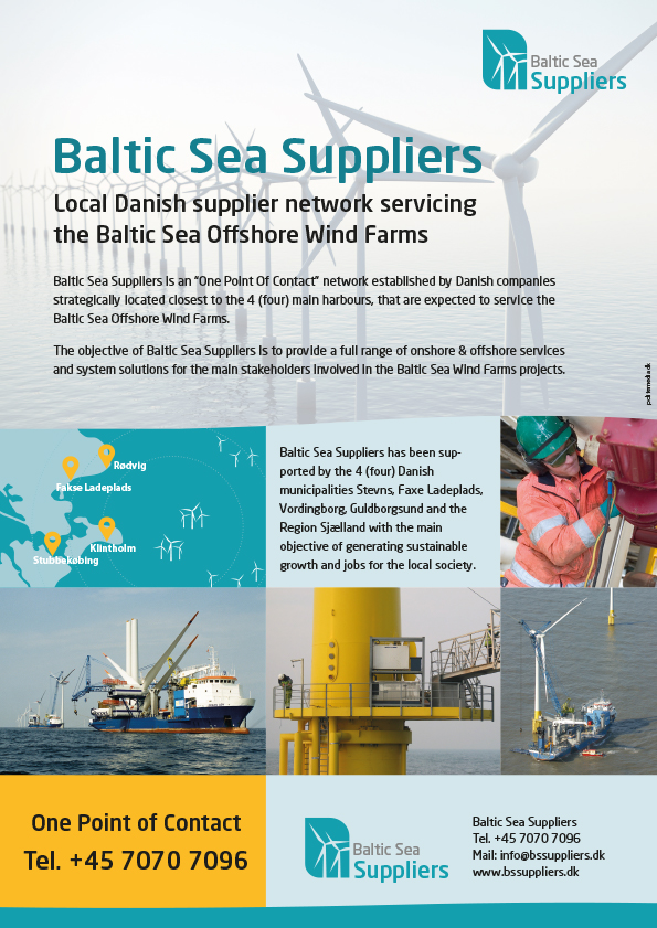
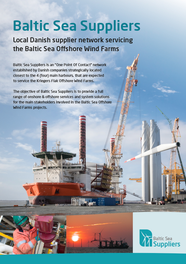
KFSG, the wind energy company has changed their name to Baltic Sea Suppliers. With the new name, we proposed a new logo representing the wind masts. We chose green marine colour on their promotional materials to communicate what the brand is to be known for. We created the visual materials such as: vouchers, leaflets, and the registration forms. In collaboration with Polite Media the website was brand redesigned.
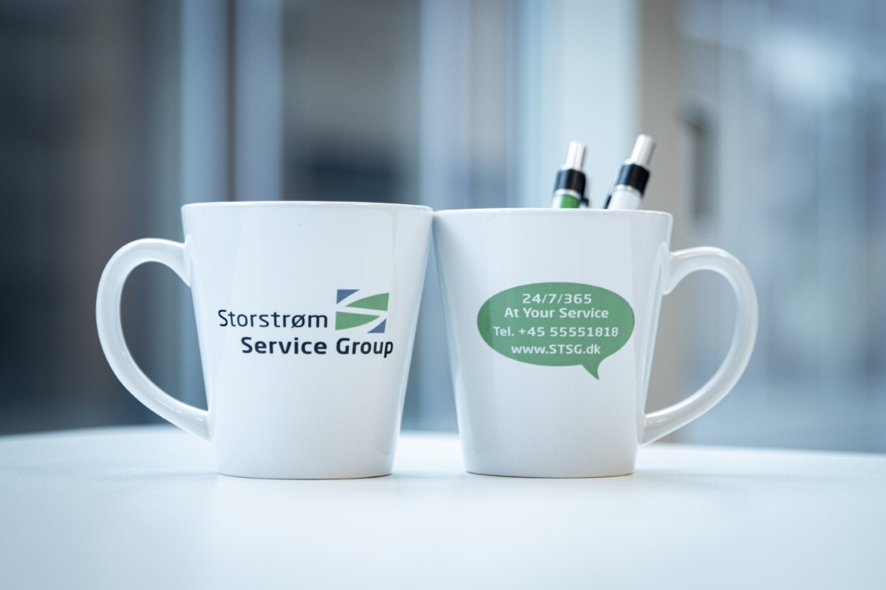
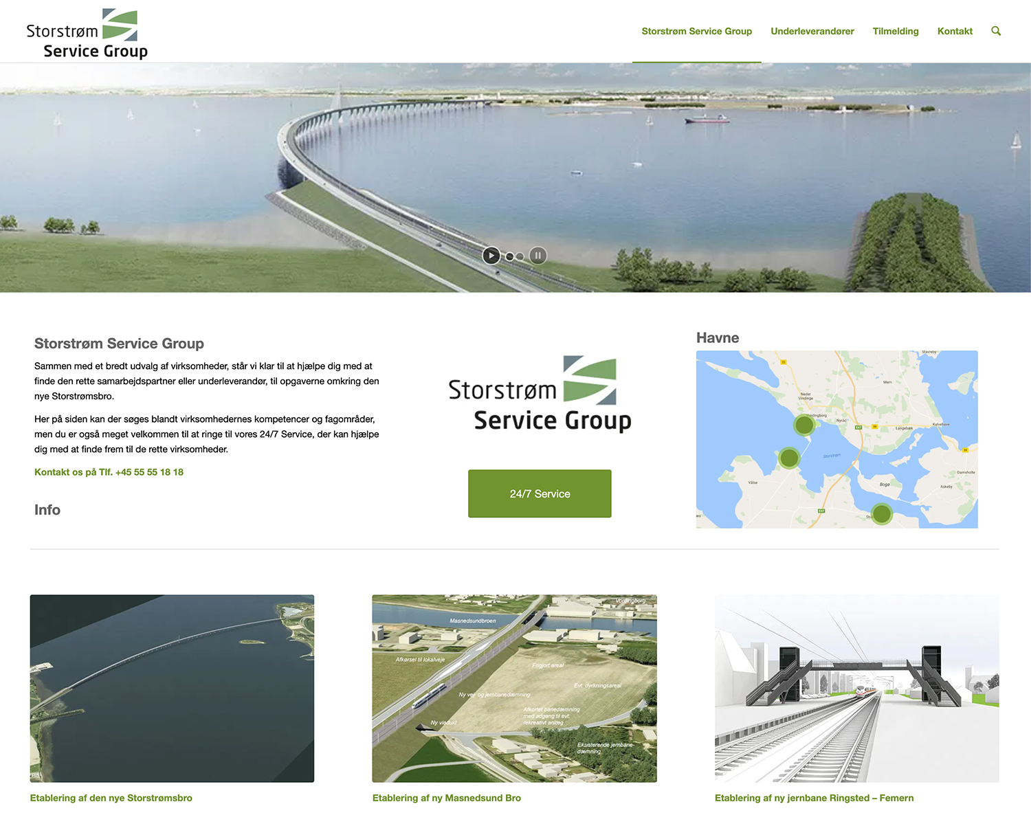
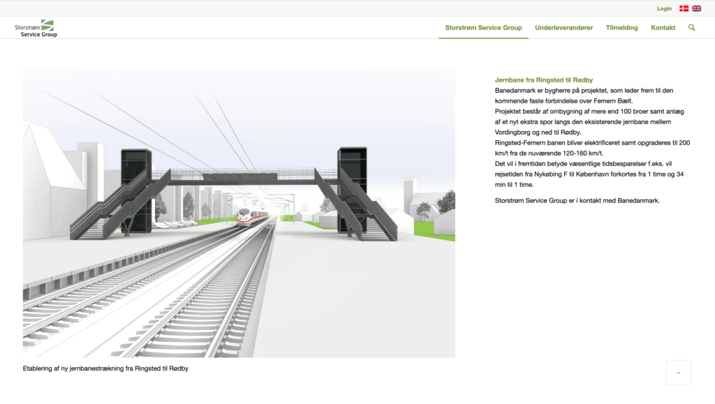
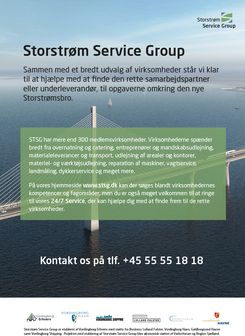
Storstrøm Service Group
is a network of suppliers who joined their forces to provide their services for the Storstrøm bridge construction. The network was a new initiative and needed to develop a visual identity. We created the brand from the scratch with a new logo design, posters, promotional items, and a website. The website has been designed in WordPress in both Danish and English and features over 150 member companies categorised according to their competencies. The website is produced in collaboration with Polite Media. The unique visual identity has been a significant factor in creating visibility and awareness of STSG and the benefits for member companies.
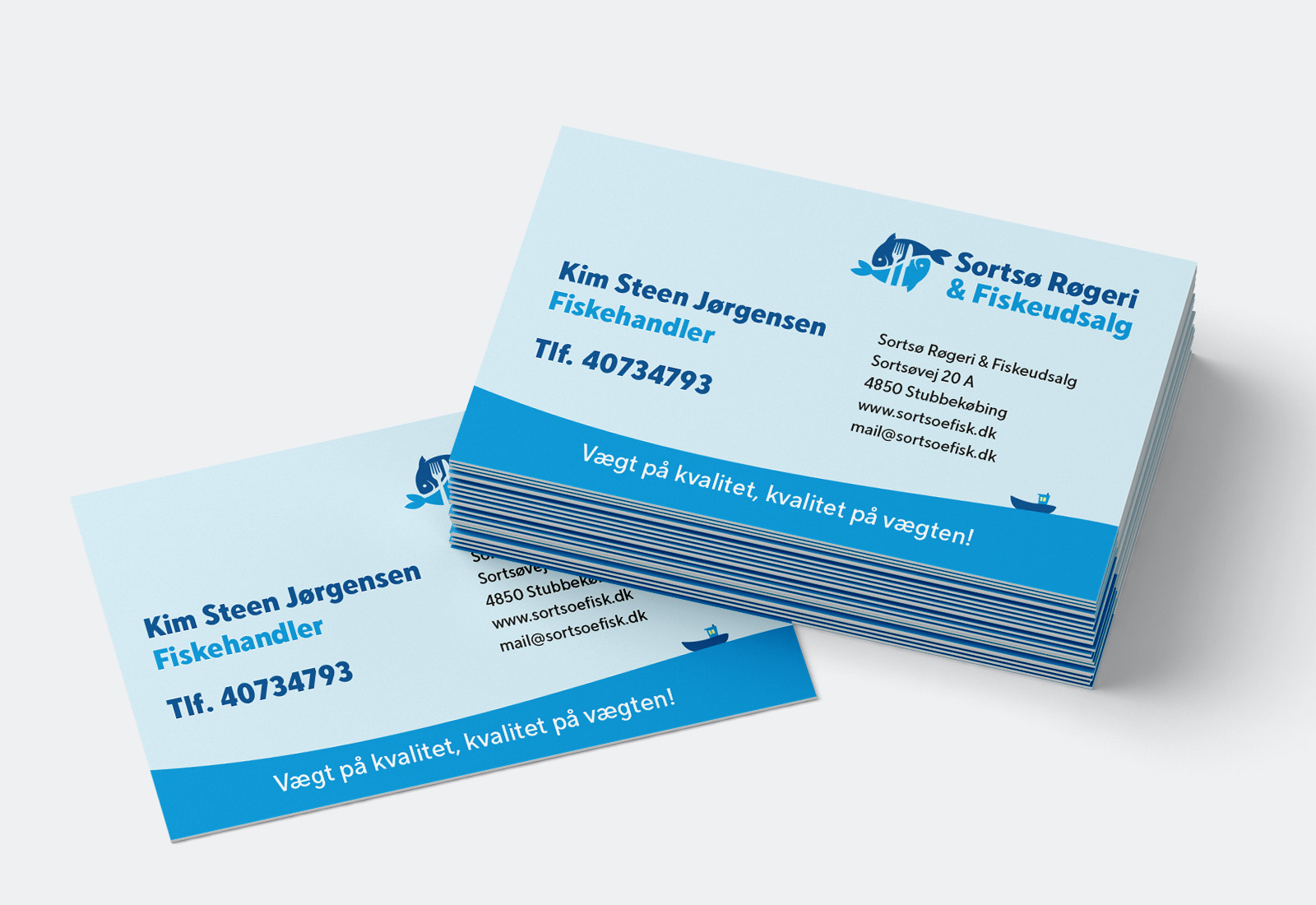
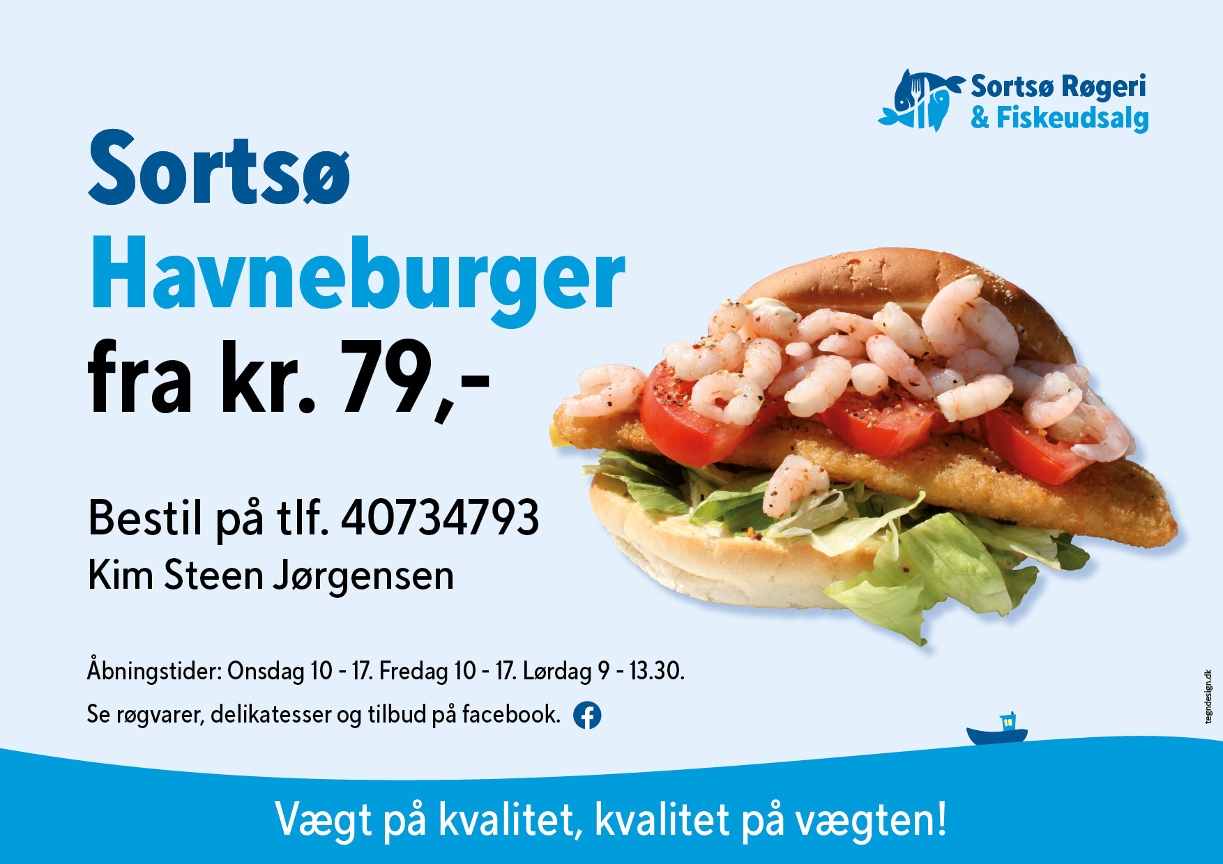
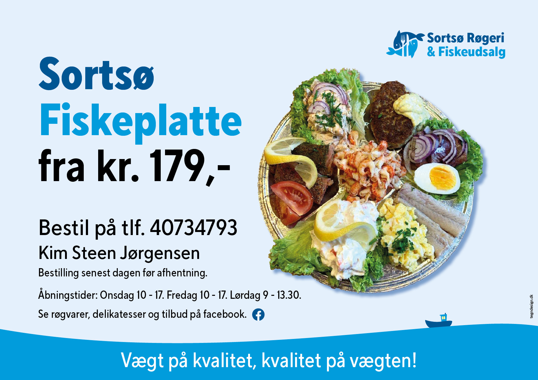
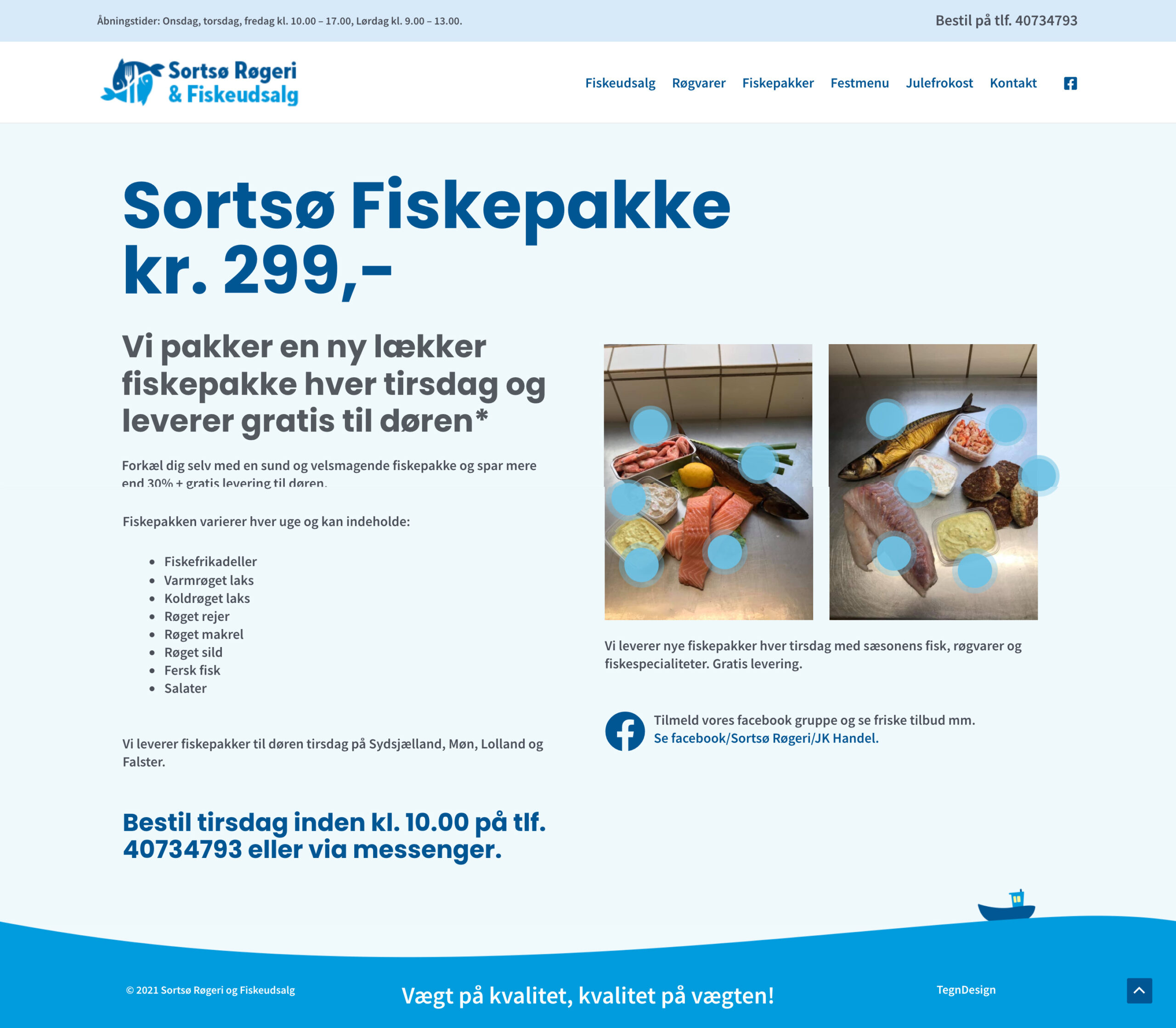
Sortsoe Fish
Sortsøe Fish is a local retailer of delicacy smoked products and fresh fish as well as seafood and salads. They deliver delicious fish packages weekly to customers in Zealand.
We have designed logo, slogan, website, ads, signs and graphics for facebook.
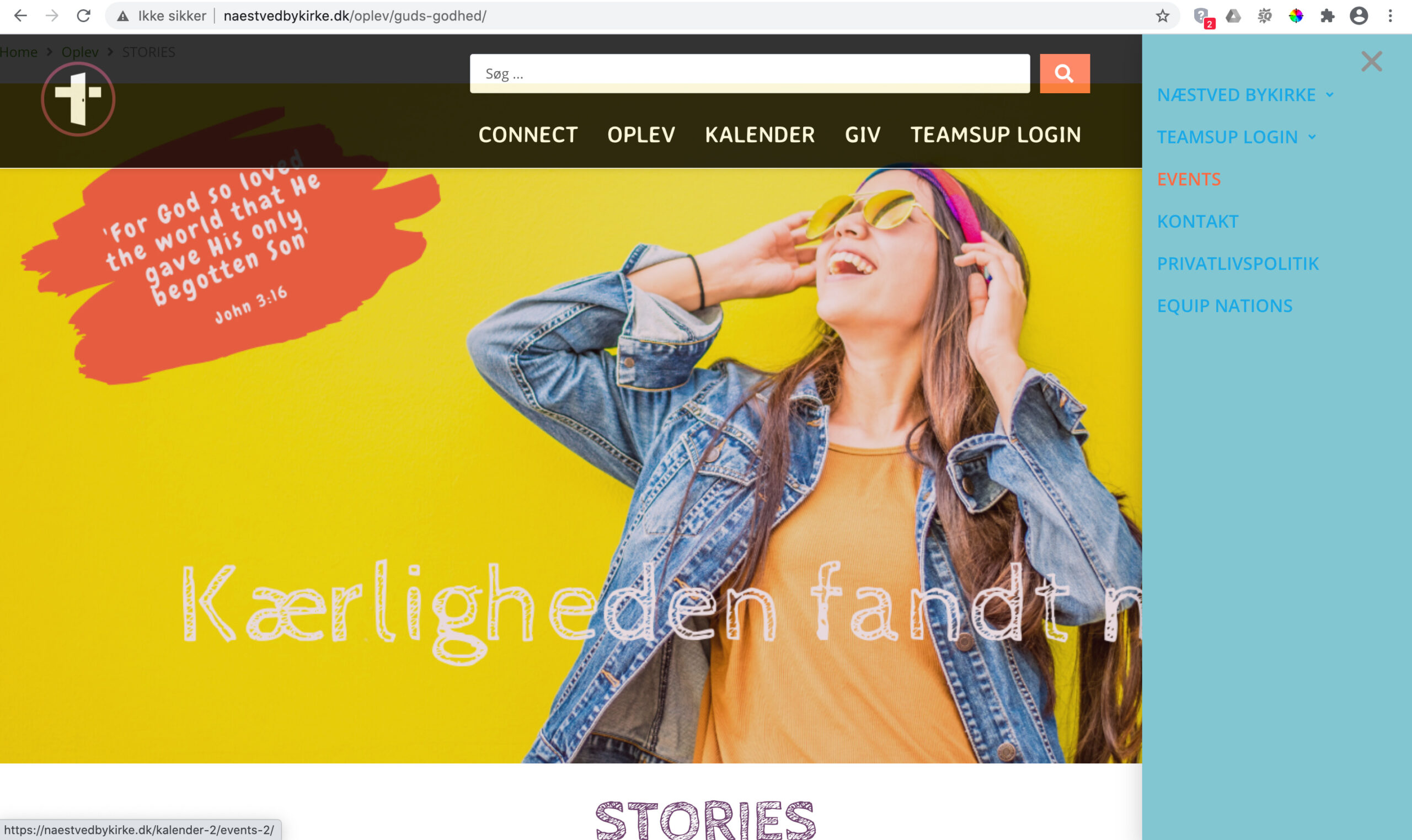
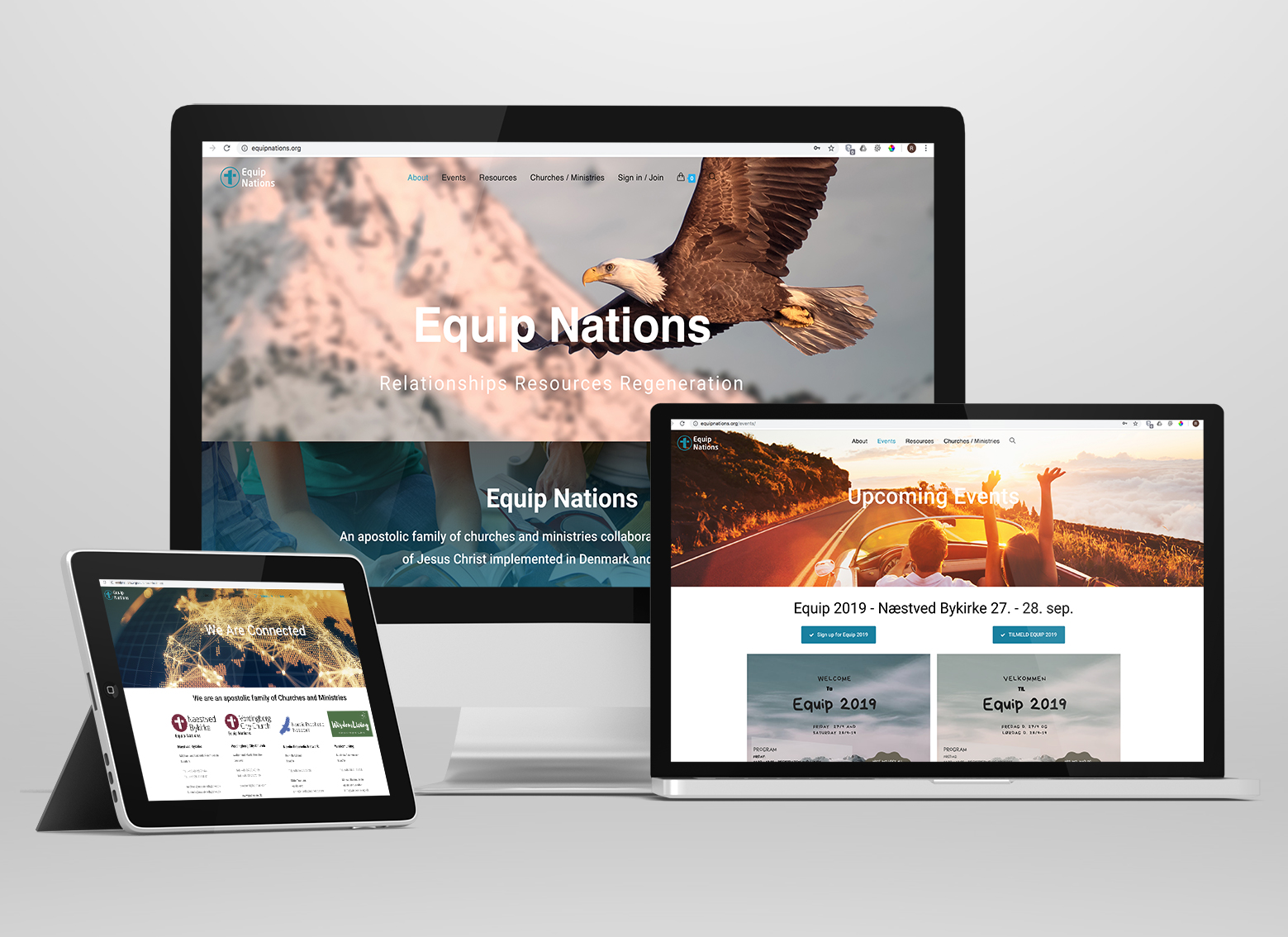
Naestved Bykirke
is a church organisation that wanted to expand to an international ministry called “Equip Nations” gathering a group of churches in located Denmark and abroad. With that idea, the organisation changed its name and rebranded. We designed a new visual identity, graphics design and created two websites.
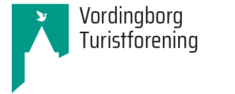
Vordingborg Business and Tourism office
represents three offices: one for the local business, one for retail one for tourism.
Before rebranding, each of the offices had different logos and identity.
The challenge was to create a unique logo that would work for three different offices gathered under one umbrella.
We created a new logo that works for all but includes a different name and colour palette. Blue stands for business, orange evokes the positive emotions associated with shopping and green represents nature site and tourism. The logo features a goose tower, that is the city’s landmark and stands in the centre of the city. The shops, and businesses surrounded by the beautiful nature make the city stand out. We wanted the brand to reflect that.
We have created the whole new visual identity for the three associations and produced marketing materials including the business cards, letterheads, envelopes, signposts, leaflets, advertisements, posters, etc.